Bit about unipoint
Smarter, safer, and more efficient IT for SMB’s.
Services
Implementing high availability of critical services to minimize downtime.
Identifying the PROBLEM
Churn, downtime, data loss, ransomware, or hacking in general.
Typography
“Techy", sharp-edged typography, intentionally targeted at pragmatic SMB owners.
Colors
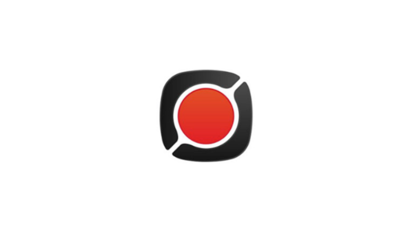
We went with a red dot, inspired by the name of the company itself: uniPOINT.
Brand Mark Exploration

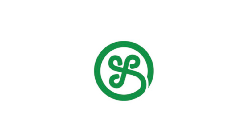
Final Brand Mark
The "subtle handshaking" alludes to teamwork, partnership, and safety.

Full Logo


Social Media Covers

Refreshed Website Design + Copywriting
Before
After


Brand Guidelines


Up for a call?
On this call, you’ll get clear
about your SaaS's brand
and what’s in the way of you resonating with your users.
about your SaaS's brand
and what’s in the way of you resonating with your users.
Thank you!