Bit about revvgo
Branding a community of individuals with a desire to push past the status quo: Community, Mentorship, and more.
For millennials, to find growth, opportunities, and genuine satisfaction in their careers, define goals, discover their strengths, and make a bigger impact.
Mission
We will create a Revvolution in the way young adults navigate their prime growth years — the 20 and 30-somethings.
Services
An all-in-one approach to personal and professional development for a membership that costs less than $10/month.
Identifying the PROBLEM
Feeling burnt out, overworked, and underpaid. Lack of direction/clarity on what they want to be when they grow up, or what they're looking for in their career path.
Typography
The GO is Caps, boldness. Being an education business, the type needed to be tight, confident, and balanced.
Colors
Trust came up a lot in our conversations. We tried multiple color options, but eventually decided on the good 'ol blue :)
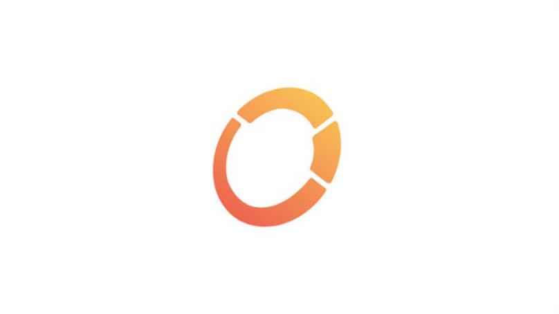
Brand Mark Exploration

Final Brand Mark
Aspirational at its core, the "star" and "squared mountain-like" alludes to a brighter future (pointing to the upper right)

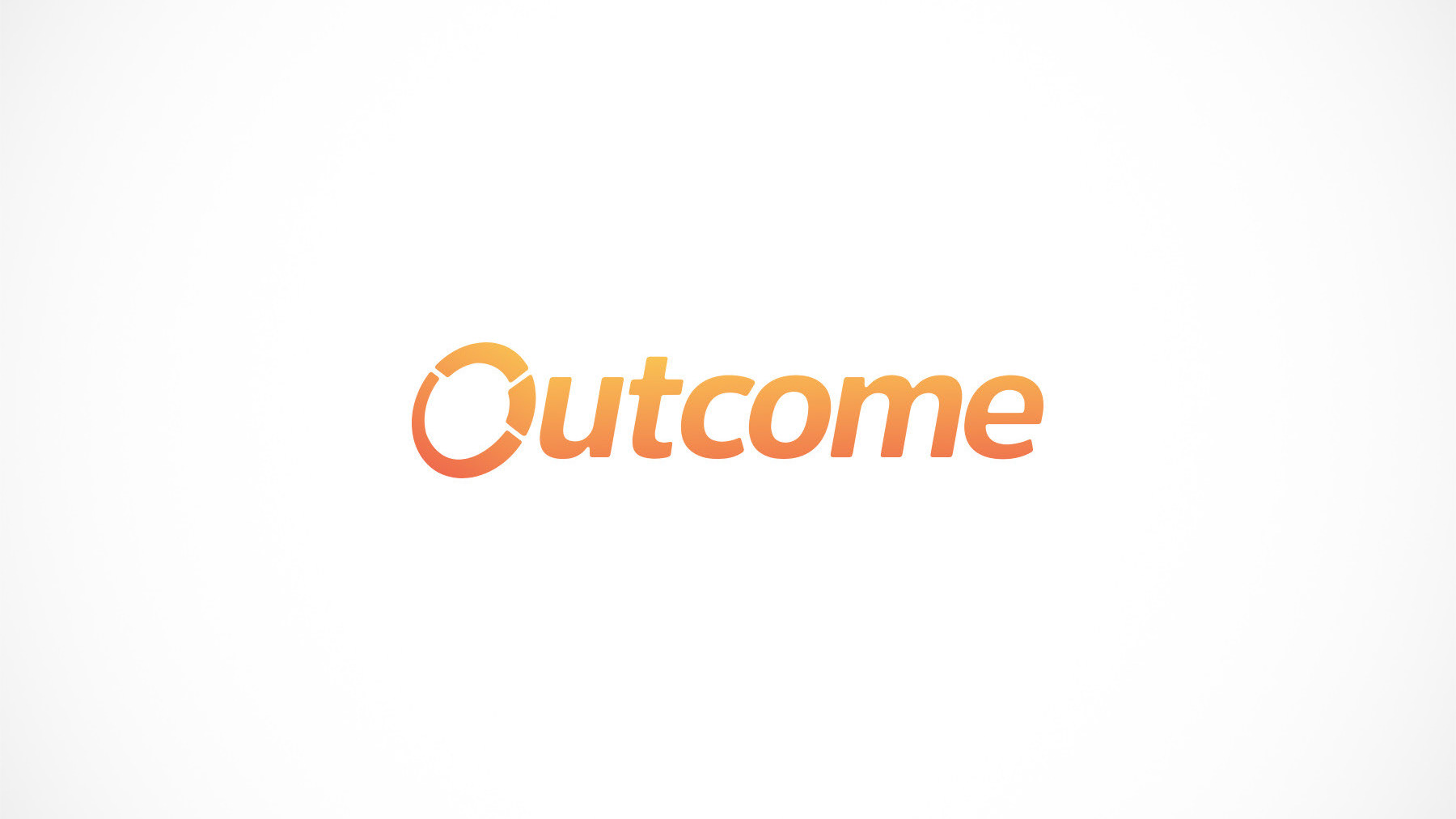
Full Logo


Colors


Social Media Covers


Brand Guidelines


Up for a call?
On this call, you’ll get clear about your SaaS's brand
and what’s in the way of you resonating with your users.
and what’s in the way of you resonating with your users.
Thank you!